City Plug: A Smarter Way to Explore & Book
A mobile-first platform designed to help travelers, business visitors, and local explorers easily discover nearby facilities such as hotels, eateries, Airbnbs, and parks. With City Plug, users can browse, book, and connect—all in one seamless experience.
Listening First (Research Insights)
To understand user pain points, I conducted:
Quantitative surveys (25 structured questions) to identify booking and discovery habits.
Competitive analysis of Google Maps, Booking.com, and TripAdvisor to benchmark strengths and weaknesses.
User interviews with travelers and locals about how they currently find and book facilities.
Key Insights:
Users want filters (price, reviews, distance) as a top priority.
Photos and reviews are critical in making booking decisions.
Many want the ability to book ahead confidently without leaving the app.
Overloaded interfaces create frustration; users prefer simple, clean navigation.
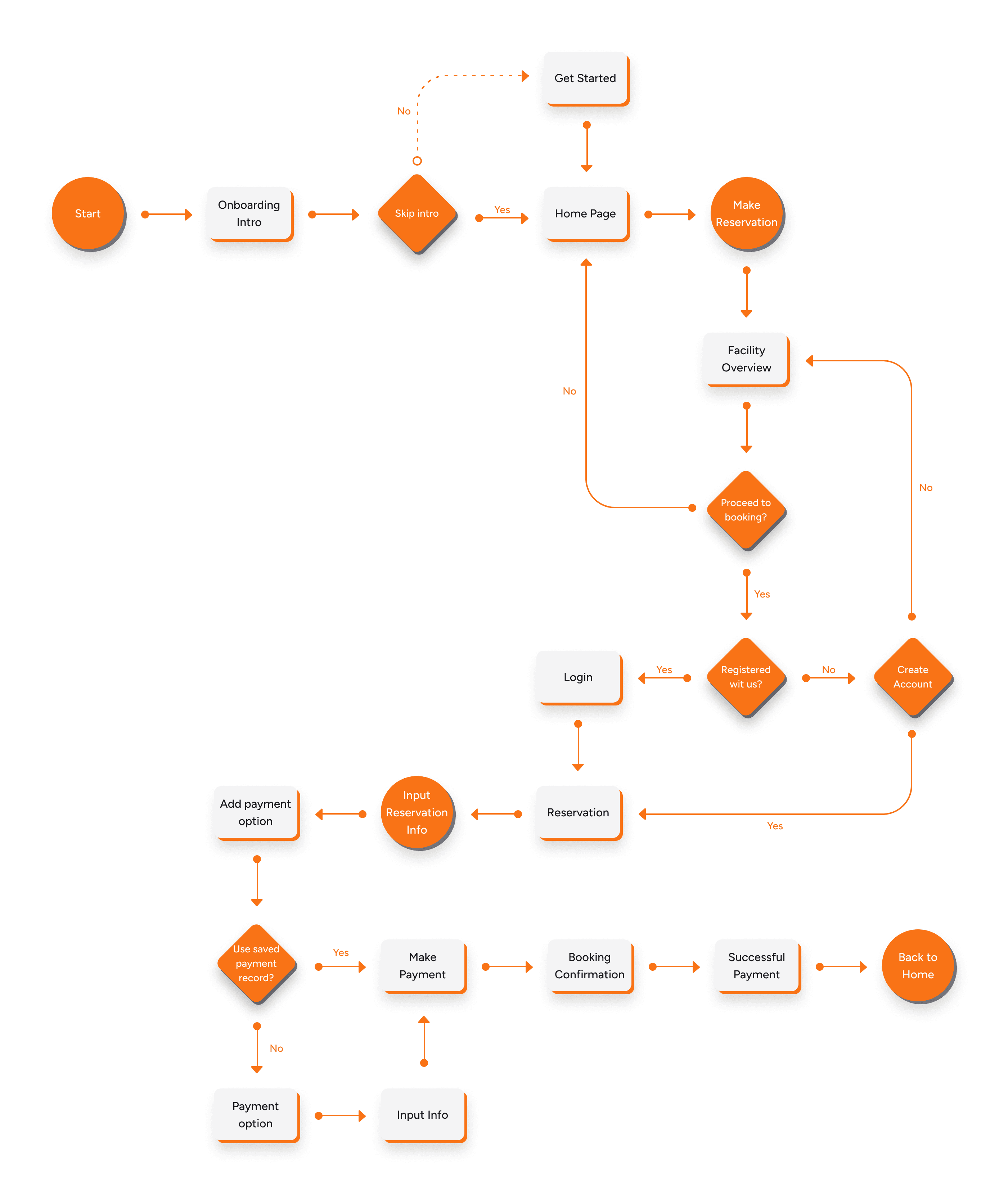
Mapping the Journey (User Flows & Personas)
I designed flows around how different users would interact with the app:
Scenario 1: A tourist arrives in a new city, opens the app, and uses the map view to find nearby hotels → checks reviews → books directly in-app.
Scenario 2: A local resident browses eateries by cuisine → compares ratings and menus → reserves a table.
Scenario 3: A business traveler filters results by distance to their meeting venue → selects a hotel → confirms booking instantly.
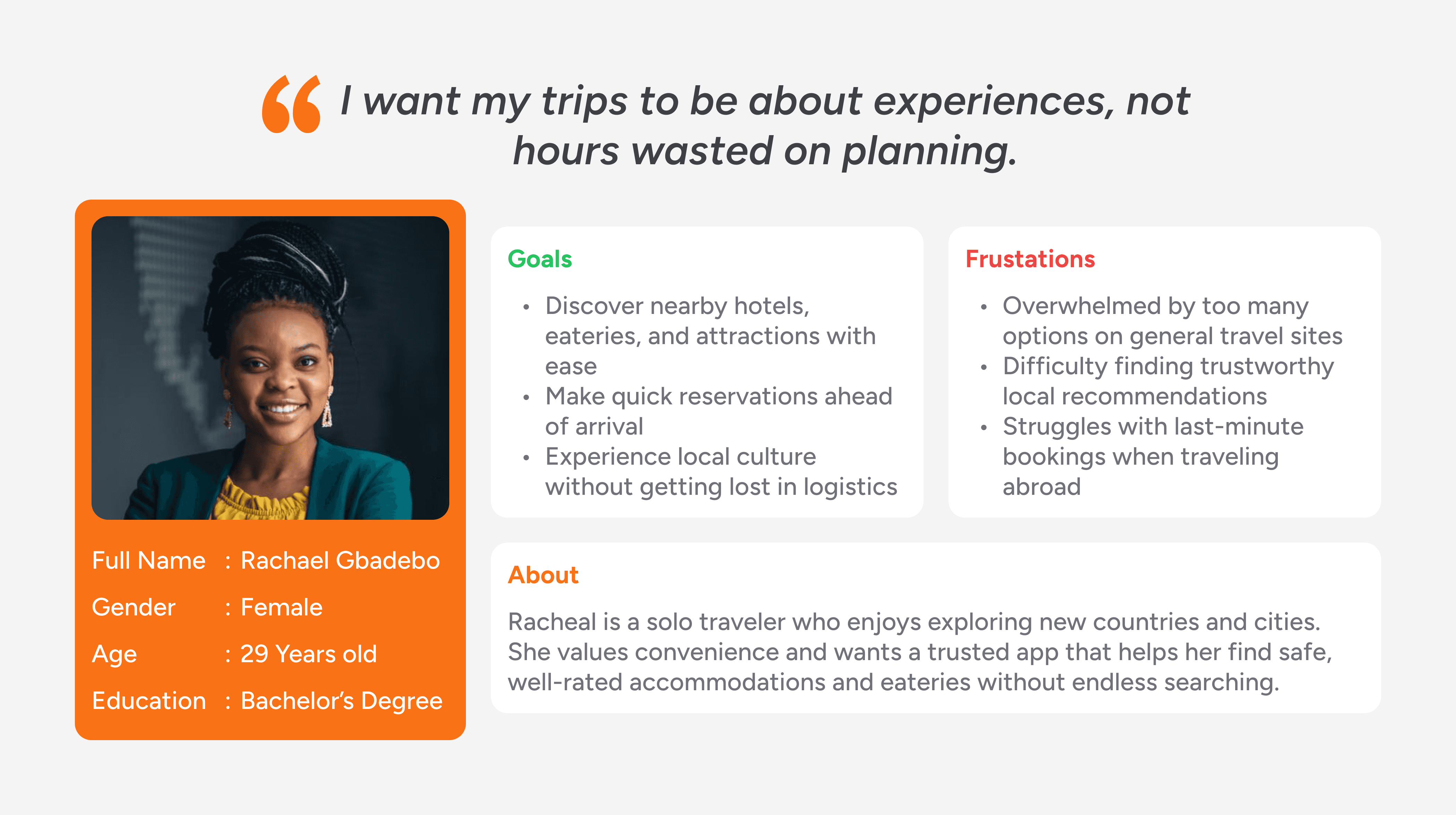
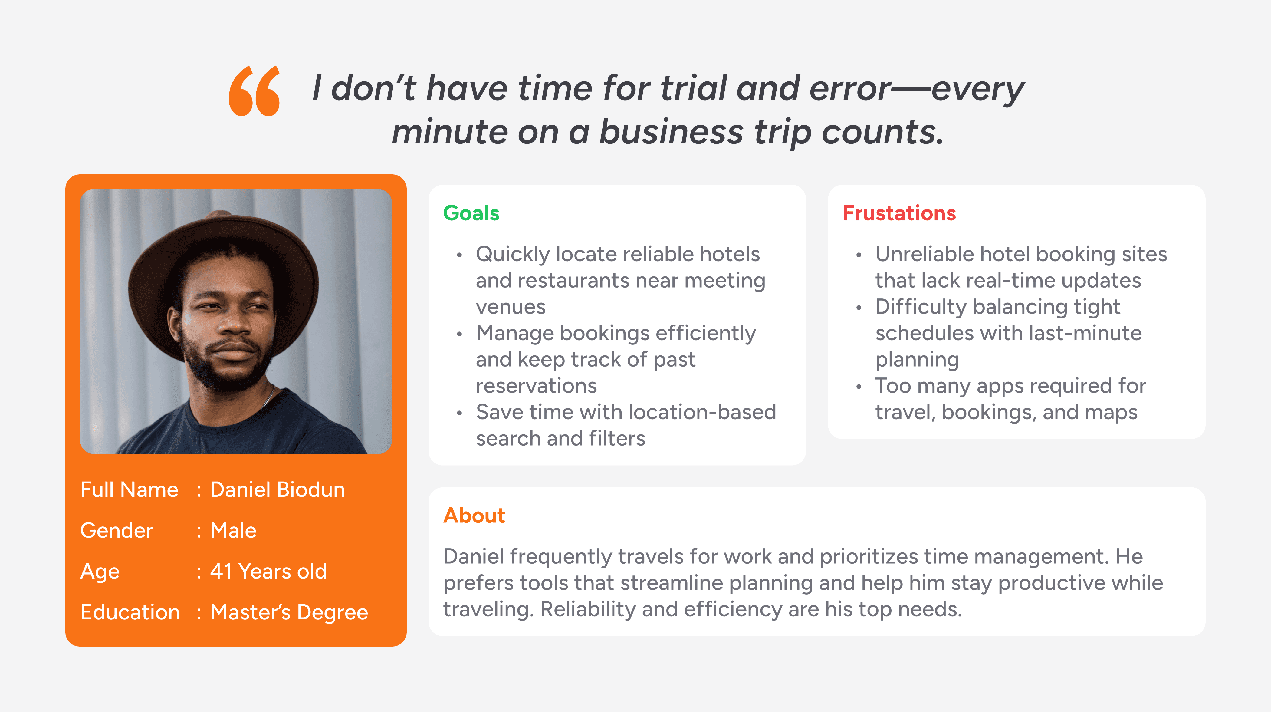
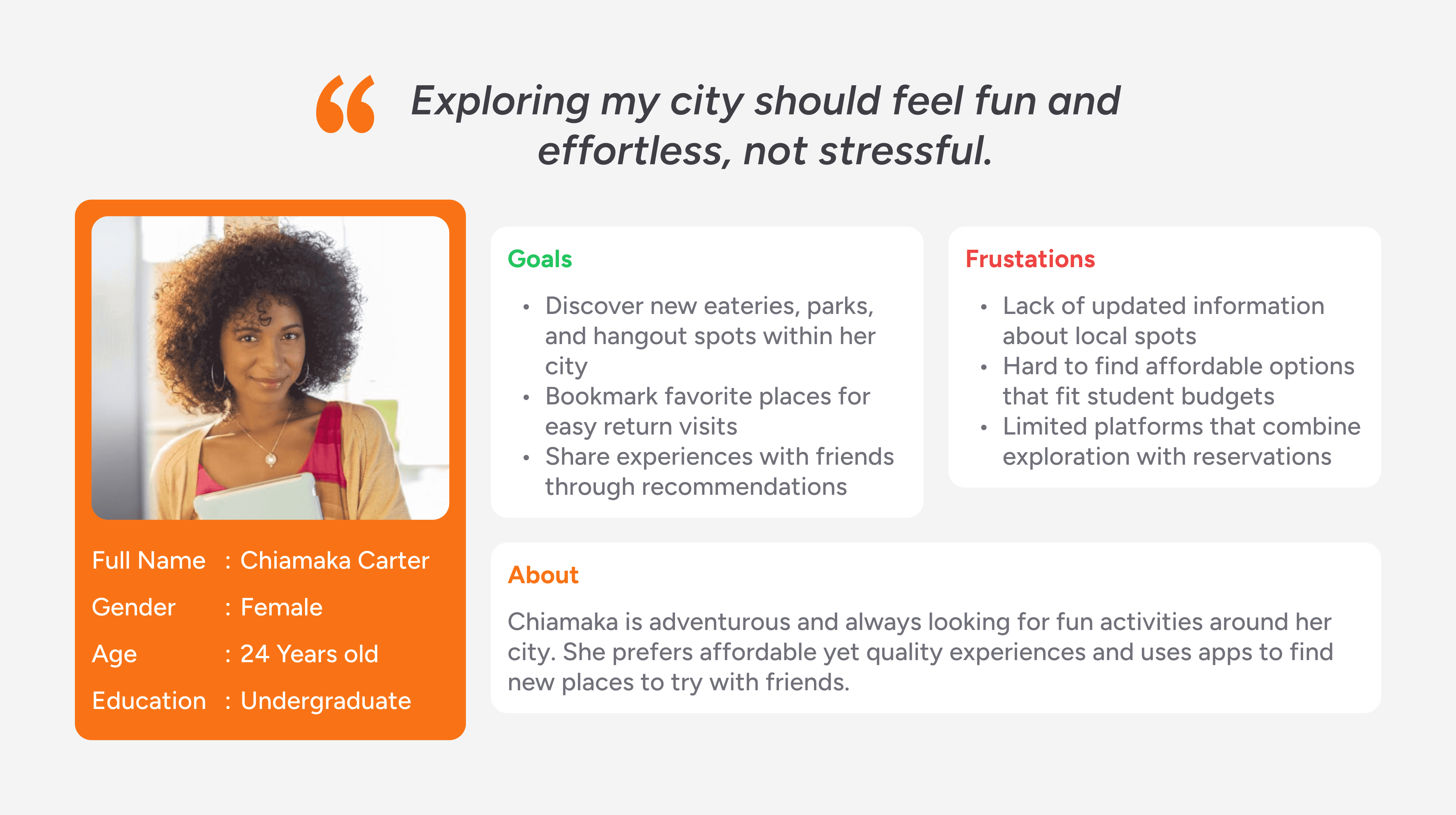
Personas
Personas such as “Rachael, the traveler and tourist”, “Daniel, the business visitor” and “Chiamaka, the local explorer” helped keep user needs central throughout the design process.
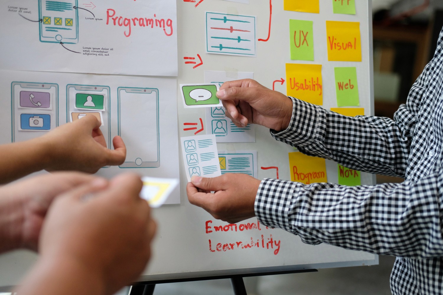
Sketching the Path (Wireframes & Ideation)
Paper Wireframes
I took time to draft iterations of each screen of the app on paper ensuring that the elements that made it to digital wireframes would be well-suited to address user pain points. For the home screen, I prioritized a quick and easy process to help users save time while browsing through the app to find the best-suited facility for their needs, and also book and make reservations ahead of time.
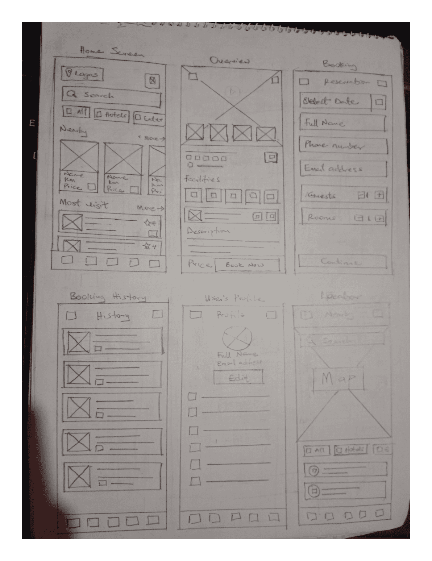
Low-Fidelity Design
I proceed with low-fidelity sketches to test different navigation models:
A map-first interface vs. a list-first browsing interface.
Navigation with categories (Hotels, Food, Parks, Airbnb, etc.) in the homepage.
A simple booking flow (facility details → select option → confirm booking).
Bottom navigation dedicated to important features (Booking History, Map, Chats & Profile).
Early feedback showed users preferred the map-first interface because it gave them a visual sense of “what’s nearby.” This guided the rest of the design decisions.
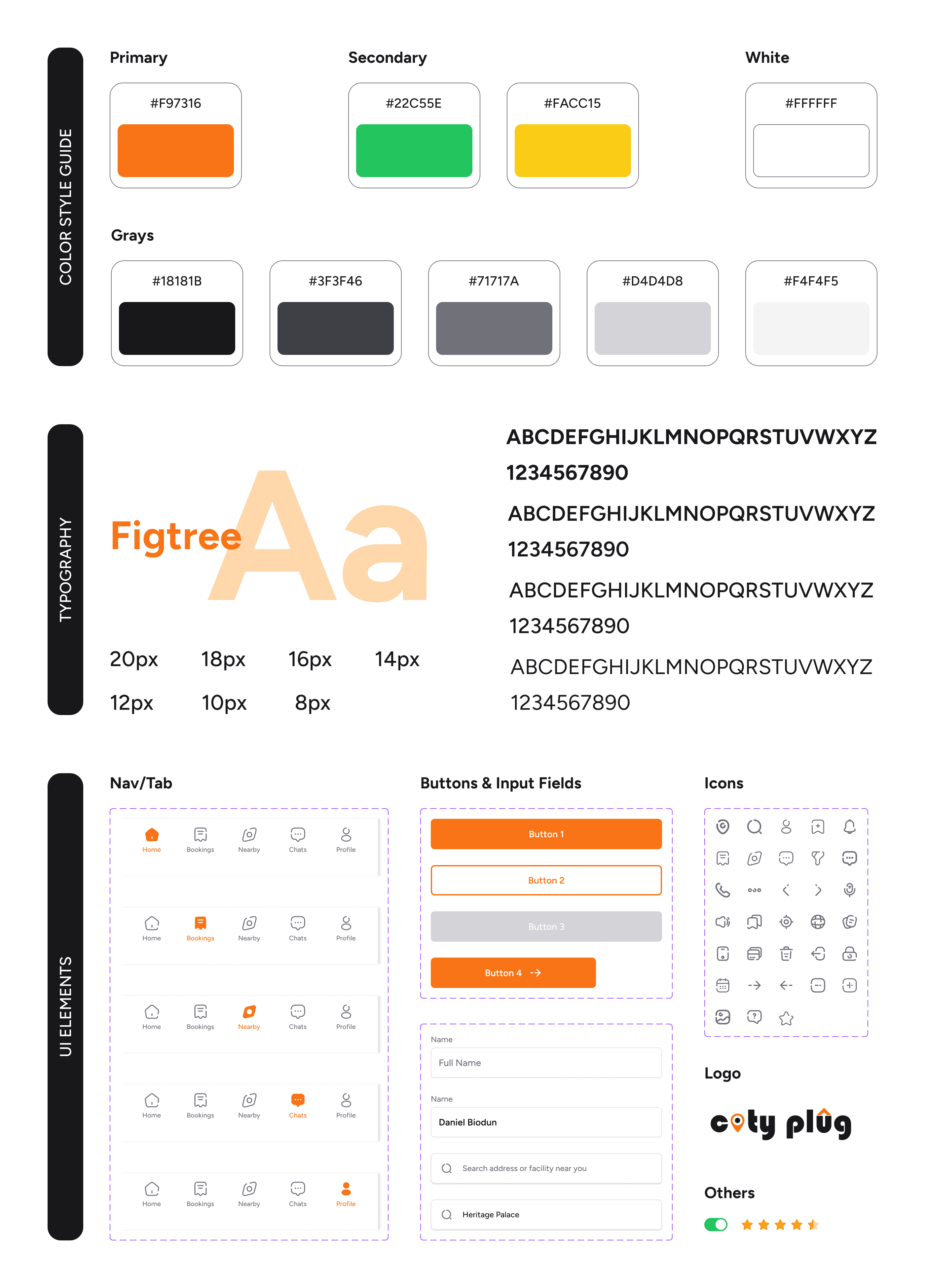
Visual Design Choices (Style Guide)
This design system establishes consistency, trust, and usability, while reflecting the app’s role as a modern, vibrant, and user-centered tool.
Colors: The palette combines a vibrant primary orange for energy and call-to-action, with supportive green and yellow for positivity and highlights. The range of grays ensures readability, balance, and a clean modern aesthetic.
Typography: Figtree was chosen for its modern, geometric sans-serif style that balances friendliness with clarity. Its scalable sizes maintain readability across headers, body text, and labels, reinforcing hierarchy and consistency.
Icons: The outline-based icons are simple, consistent, and easily recognizable. They reduce cognitive load, support intuitive navigation, and align seamlessly with the clean, modern feel of the overall design system.
Designing the Experience (UI Design)
To create a visually appealing mockups, I ensured that I consider the principles of designed, the insights gotten from the ideation process and usability studies, accessibility and inclusiveness.
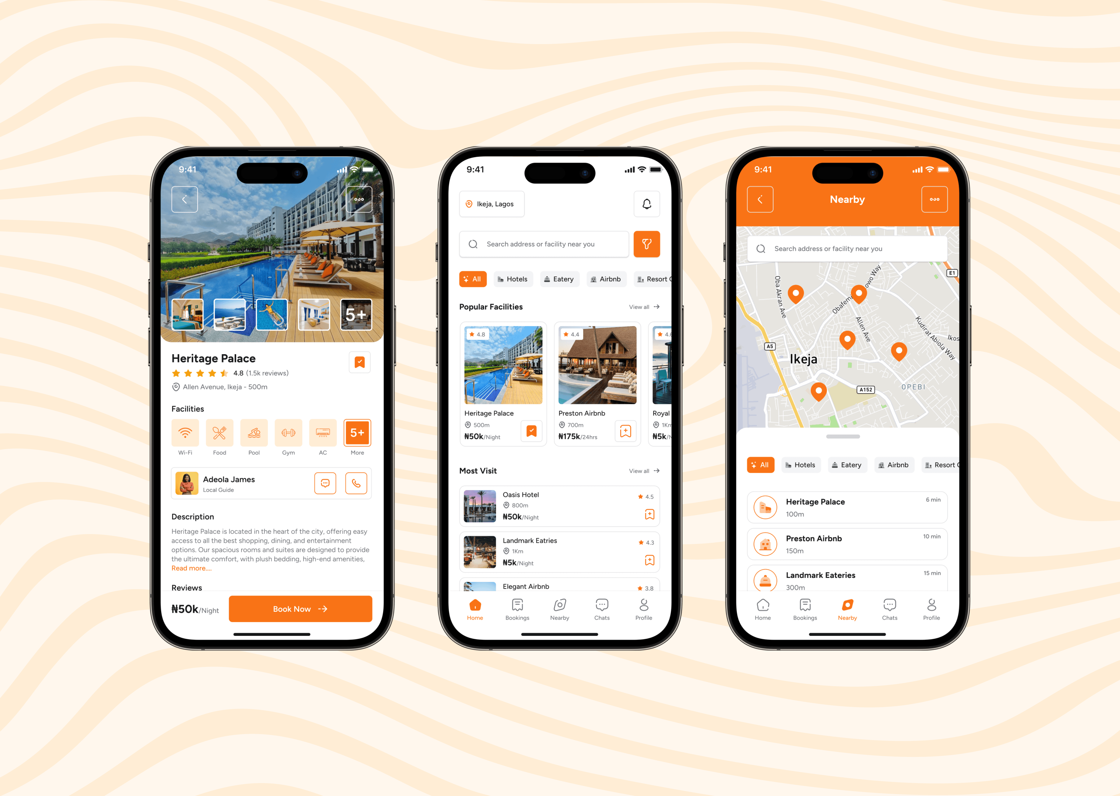
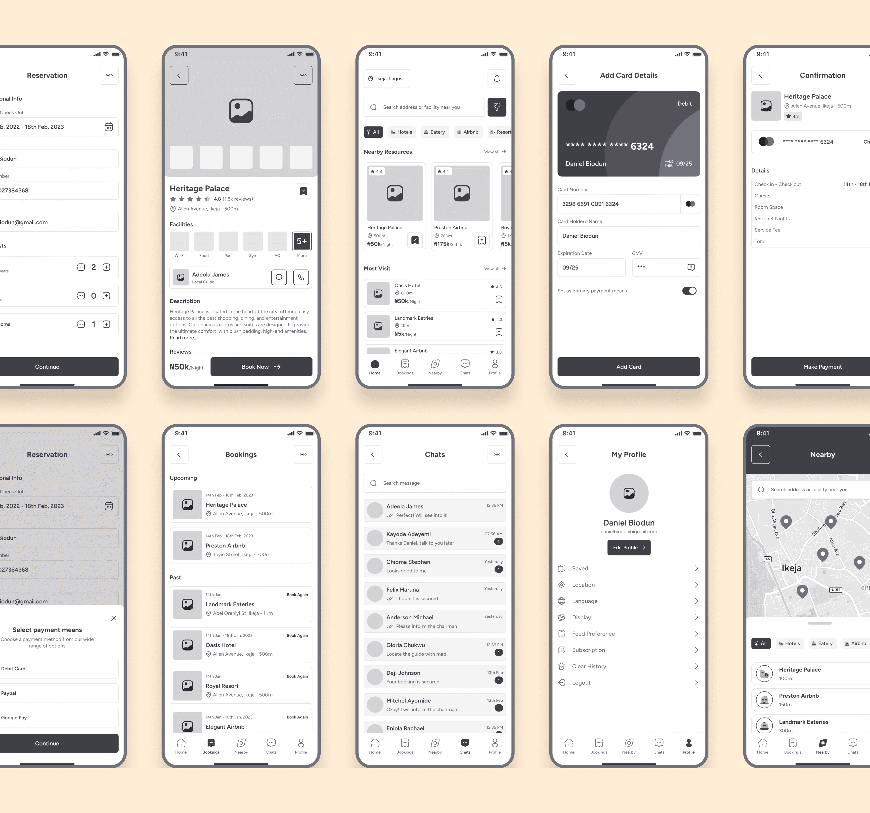
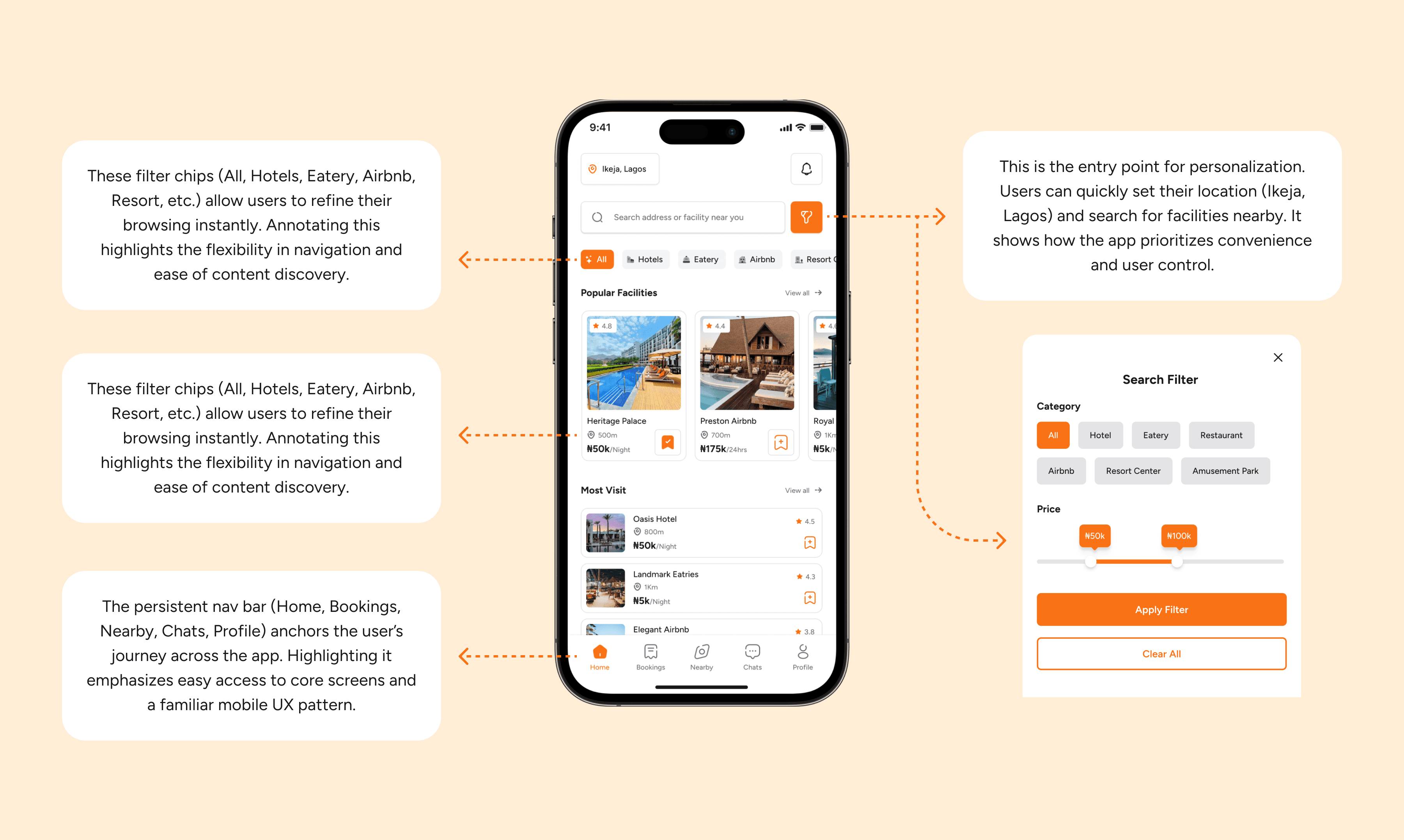
Homepage
The homepage serves as the central hub, offering quick access to featured facilities, personalized recommendations, and navigation to core features. It’s designed for easy discovery, ensuring users can explore options instantly.
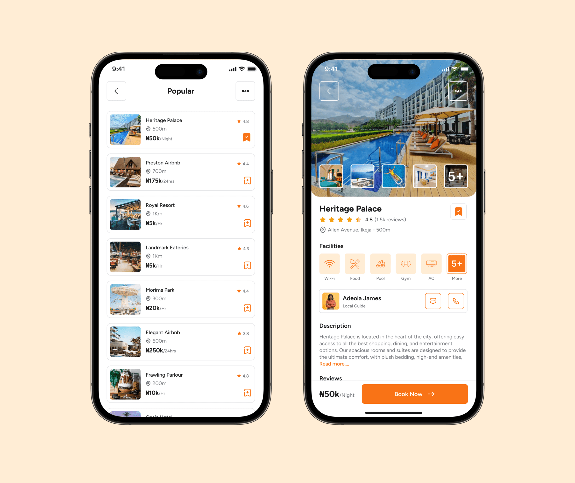
Facilities & Details Page
This screen presents facilities in a structured list with essential details—images, ratings, and pricing—allowing users to compare options at a glance before diving deeper into individual profiles.
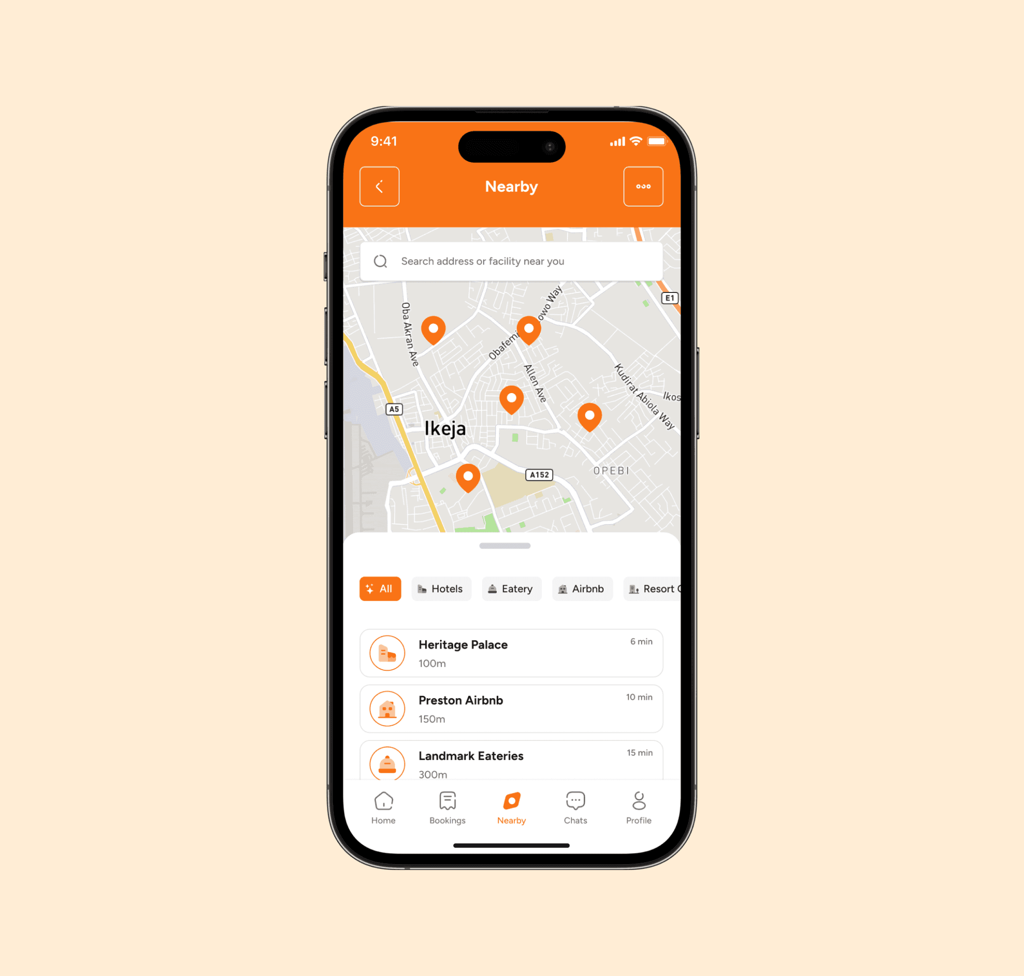
Nearby Map Locator
An interactive map that pinpoints nearby facilities, enabling users to visually explore and filter based on location. It complements the listings, giving a spatial perspective for quick, location-based decisions.
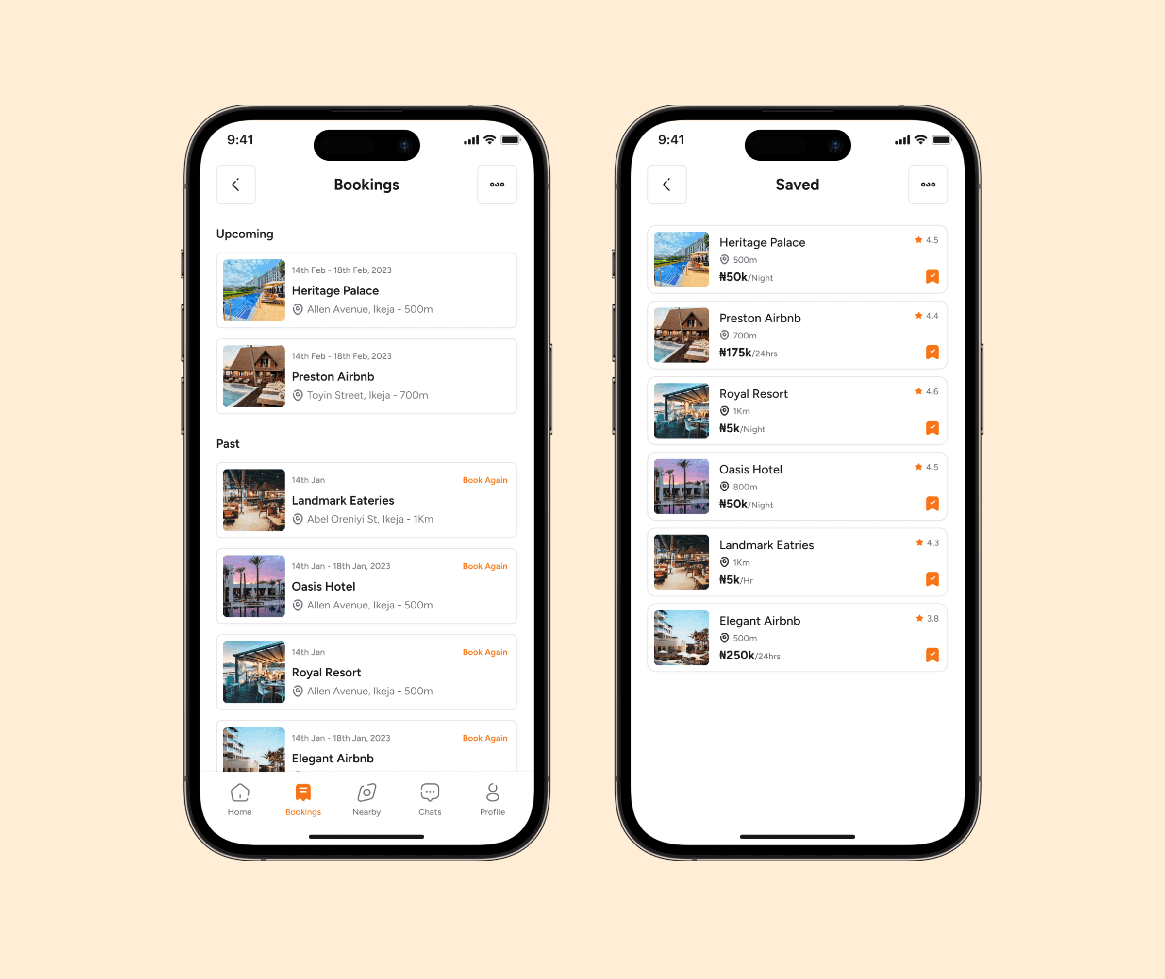
Booking History & Bookmarks
Here, users can manage past reservations, track upcoming bookings, and revisit saved facilities. It provides a seamless way to stay organized and quickly rebook favorite spots.
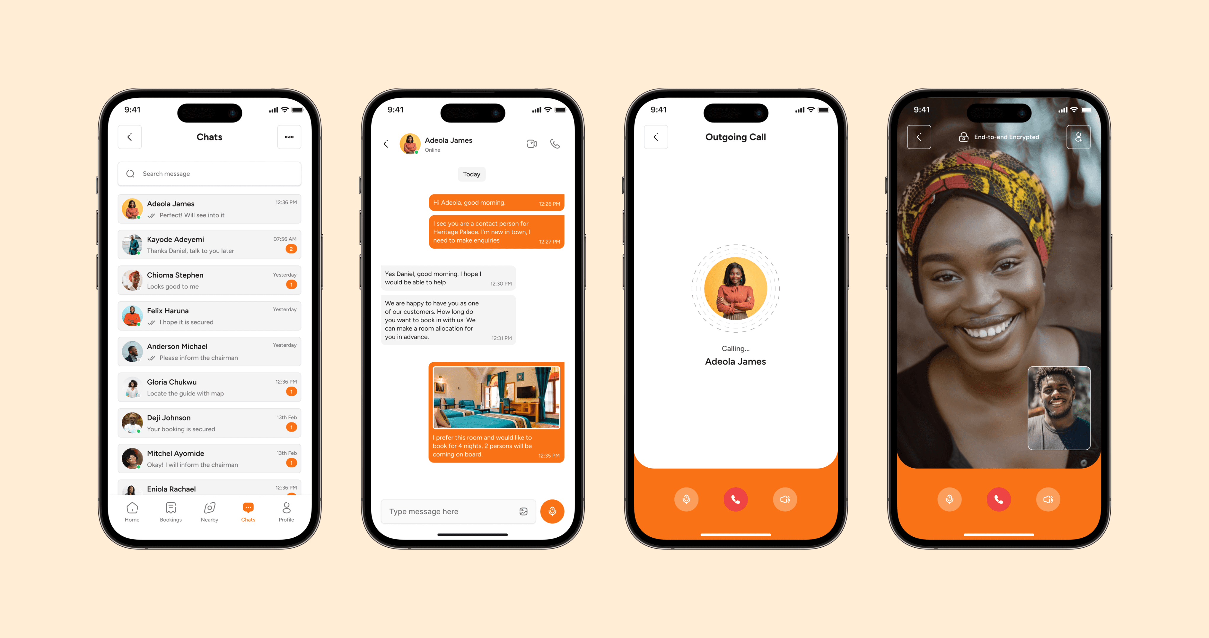
Contact & Support
The contact screens offer users multiple ways to connect with facilities—via direct calls for urgent needs or in-app chats for real-time conversations. This flexibility ensures quick responses, personalized assistance, and smoother booking experiences.
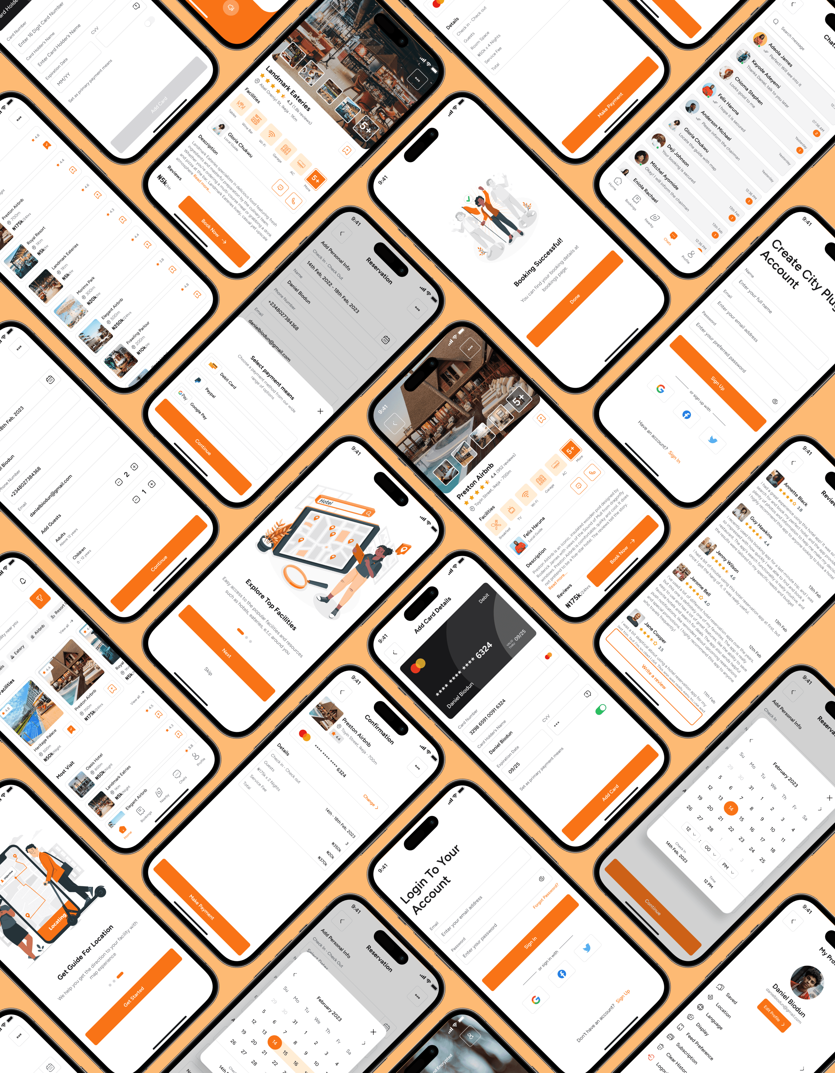
Other Screens
Supporting screens such as Profile, Settings, Notifications, and Help ensure a complete user experience. They provide personalization, account management, and guidance, complementing the core journey while reinforcing usability, trust, and overall app consistency.
Testing & Iterating (Usability Validation)
I conducted usability testing with 8 participants to evaluate the overall flow and interface preferences.
Positive Feedback:
Most users preferred starting with a list view rather than a map view. Their main reason was that a list allowed for faster scanning, easier comparison of prices, ratings, and availability without the distraction of navigating a map.
However, users also highlighted that the map feature is still very important, especially for final decision-making. Once they shortlisted options from the list, they wanted to switch to the map to visualize proximity and plan routes.
Areas of Iteration:
The list view was prioritized as the default starting screen for discovery.
The map view was integrated as a quick toggle option within the list, so users could seamlessly switch between both modes depending on their needs.
This adjustment struck a balance — giving users the efficiency of lists with the contextual awareness of maps.
The Outcome (Impact & Results)
The final solution delivered a streamlined discovery-to-booking experience:
Users reported finding facilities 50% faster with the map-first browsing feature.
The booking process felt seamless and stress-free, compared to juggling multiple apps.
Overall, testers appreciated the all-in-one convenience of the app.
Looking Ahead (Next Steps)
Future iterations could include:
Integration with ride-hailing apps for direct navigation.
AI-powered recommendations based on past preferences.
A rewards/loyalty system for frequent users.
Key Takeaways (Reflection as a Designer)
This project taught me the importance of balancing exploration and booking flows within a single experience. I learned that:
Simplicity wins: too many features overwhelm users.
A map-first design can be more intuitive for location-based apps.
Iterative feedback is critical in fine-tuning booking flows and building user trust.
As a designer, this project strengthened my skills in UX research, competitive analysis, prototyping, and usability testing. More importantly, it highlighted how thoughtful design can reduce stress and improve confidence in everyday decisions.